Saturday, 31 October 2015
Tuesday, 27 October 2015
12.Poster Skills Development (by Aaron Toombs)
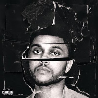
Our poster is similar to professional ones because we have taken some of our ideas from professional covers. For our real poster we were thinking of using the same techniques we have used for our previous cover on task 10 e.g Photoshop, editing everything in a certain way such as black and white. Although we were thinking of doing something slightly different and including some colour for example making everything black and white and then rubbing out the coloured parts we want on show. Also in style of our topic inspiration, we might rip our album cover and montage it like The Weeknd has done here for his "Beauty Behind the Madness" album cover.
 I like this style album cover because its original and it art styled like old fashioned covers. Modern album covers focus more on photography work and I think most other groups will do that so to make ours different, montaging would be a good technique. I think that we should include some colour though because otherwise our work would look like too much of a direct copy, also I would like our album cover to represent the video, perhaps like a singles cover would rather than a complete album. I think a singles album cover would work better anyway because it represents the song singularly rather than a collection of songs. Therefore overall I think our album cover should relate as much to the video as possible.
This way if we take The Weeknd's ideas and interpret them in our own way at least then we have the idea of a professional cover but also we have the styles etc. and ideas for our own, I don't particularly like album covers which includes faces but I think that's another way for singers/producers to promote their star image and gain more recognition whereas i feel like album covers which don't include faces are more creative and focus more on the music and the video. Additionally I think the more creative the cover is, the video also tends to be more creative and the artist themselves focus more on the art of the music rather than their fame, so I think our album cover should include something creative rather than a face, because that is too simple. However I still like The Weeknd's cover because it includes art based work rather than just a plain photo, it appeals more to people when you have a good album cover and people will become more interested if it appeals to the eye as people do tend to "judge a book by its cover".
Thursday, 22 October 2015
11.Album Poster (by David Wegierski)
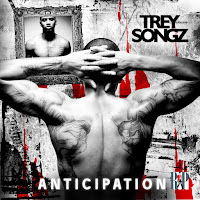
 Here is the album poster representing the artist Trey Songz and his music. He is a male hip hop artist the code and convention is the stereotype that most black male artists are normally naked to the waist, to show their tattoos and muscles. The artist might be naked to the waist down in order to show his tattoos that may reveal another story or a memory. The picture/background represents the rough environment, this may represent his songs. The red marks on the background in front of their rapper may represent blood therefore violence in the environment that the artist is currently in. The reflection of the artist in the framed mirror shows that the artist has a different posture. However the actual album cover that the artist uses for music has the picture of the artist in the reflection. We can see that the font used in the album poster and the album cover is pretty much the same. Also the album poster is in a black and white filter to represent the environment and the music that the artist produces. The artist could also be in a dark place since most of his body is in shade. The whole album is very dark and mysterious showing violence and a rough environment.
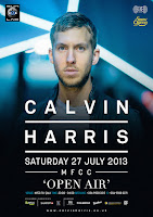
  Another poster that I have decided to analyse was a Calvin Harris poster. This is slightly different form the Trey Songz poster as it provides much more information, it shows the date of the next concert, contact information, address and etc. Here we have a picture of the artist right in in the upper middle position. The artist is dressed very formally and stereotypically for white man in his 30s. The background creates an atmosphere like the artist is at a concert/party judging by the blue flashing lights behind the artist although the corners of poster are black. The whole poster looks very flashy and shiny, as we can see in the text as well as the background. This might suggest to us that the artists’ music is electric/pop. The “Calvin Harris” title is displayed first from all the other texts to attract the listeners by them being able to see what the poster is about just by looking at it from far away. Then the text goes smaller as it goes down displaying the most important information from the top to the bottom. This is a very important technique when creating an album cover poster because the poster must be able to attract the customers by displaying the most important/attracting title first and then the rest of the information about what the poster is about. The font of the text is very formal and clear to read from far distances
 Tuesday, 20 October 2015
10.Random Album Cover (by Aaron Toombs)
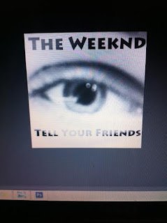
 For this task me and David decided to go take some photos of different things including landscape
 etc, one of the best photos was an eye and it kind if relates to the song the most. I decided to edit some of the photos on Photoshop and I liked this one the most. We used a digital camera which for our real cover we need to use them so much unless needed. Photoshop was also a key tool to use, better than using art styled work to create an album cover seeing as most album covers recently photography based, therefore I think we will take photos and then use Photoshop to edit it the way we want to, all of us have Photoshop installed and know how to use it to a strong enough standard therefore this will not cause any complications and we will use our creative minds to think of something which relates to the song and looks good. I like the whole black and white concept, quite dark themed puts a downer on the mood of the song and that will relate to the song itself. For this font I used a Photoshop pre-set, but for the real thing I think I will definitely have to download a font style and use it because the font here doesn't look to professional and also I think it may be too dark, needs to kind of fade into he photo so that's what I'll try and improve for our real album cover.
Thursday, 1 October 2015
9.Digipak (by Ben Furby)
A digipak is the packaging on a CD cover that shows what the album is (artist its by) and what album has been released by the artist. The digipak shows the trademark for the artist and the album being released, if its a new style more people will want to buy it as it shall stand out from the others.
Digipaks are the only other real alternative to the original jewell cases used by producers to sell artist music. The fold out design of the Digipak often includes additional information about the band/group/artist. Digipaks are not always the only option, as many record companies offer both this option and the standard jewell case. This allows 'special addition' albums to be released at a higher cost to consumers as well as the simple design jewell case.
The fold out flaps on the digipak is another way of the band of artists to give out more information about them and also the newly released album to the public. This can increaase the bands publicity as the public will have better known knowledge about the band or artist itself, this will widen there market.
The digipak seemed to take off further in the early 2000's, where many large producers could adopt the ethical stance of 'economically sound' meaning recycled materials and ink could be used to make them appear more caring to the market.
8.Idea Update (by David Wegierski)
IDEA 1.) Original Plan – For the song “The Hills”
Before the music starts the phone starts ringing as the ring tone exactly at half past,
Phones on a table, the first 5 seconds shot of the phone is slowly closing up. Phone suddenly starts ringing as the music starts playing.
Close up 45 degree clockwise slow turn eyes towards the sun,
When it gets to “Gated residents” shot from the passenger’s seat of the driver driving through a rich estate, another shot of the car driving taking a clear slow shot of the housing estate
“I only call when it’s half past” Shot of a watch landing exactly on half past
Another time “I only call you when it’s half past” Shot of a clock smashing in a dark back ground in slow motion
Walk along the side of the road, close up from the side the paste of the walk, front & side,
Bottle of vodka slow motion drop till it breaks
Shot of a clock smashing at half past.
IDEA 2.)
(NEW CONCEPT) – For the song “Hills”
Costume: Full on black suit
Whole video is about a person walking to a direction, shots of the road, alongside of the road, close up of walking, Different locations
Transition of walking along the side of the road in many directions, shots of the long road going down to Stowe.
IDEA 3.)
Middle of the field, Headlights turned on, nearly getting dark, dragging a body of a boot, dragging it down in the middle of the field, slow motion pouring “petrol down on the body”,
Moment when the song drops, close up of a lighter, dropping on the body
Walking away from the body burning in flames, at moment when he walking away towards the car,
Another shot of the car in the windshield
Person getting in the car
Driving away , “Real life” coming on
IDEA 4.)
Song – Tell Your Friends by the Weeknd
Initial script:
Camera in one position, drive by side of the car person coming out from it, lip syncing to the song, walks around the car as he continues to lip sync, gets out a large petrol tank, puts it down near the camera,
 Opens the boot again, takes out a bin bag, containing possibly a body in it.
Camera turns around 45 degrees in the direction of the field.
Drops the body as he walks down 100 metres down
Close up of the person walking towards the car grab a petrol tank
Close up of the legs walking on the side,
Close up of the face
Side shot from the petrol tanks view
Grabs petrol tank
Another close up of the middle shot of the person lip syncing
Pours the petrol down on the body
Close up of the petrol tank
Turn head to east west, checking for anyone seeing him,
Grabs a lighter out the pocket, lights it up
Close up of the flame in the lighter, transition into the shot of the drive by the restaurants near the Stadium in Milton Keynes
When he stops singing, slow motion drop of the lighter in the fire
Another point he start singing “tell your friends about it” The bin bag lights up going in flames
Close up the person walking away slowly,
No music
He walks towards the car
Looks back twice
Slow motion
Fire beside near the person walking away
“Tell em this boy wasn’t meant for”
Close up of the character lip syncing towards that song
Close up of his legs walking on the side
“I will be the same never change”
Camera will be inside the car, on the side as the character opens the door to get in the car
Turns the engine on
Slowly drives away
No lip syncing as he gets in the car
Slowly drives away
Side shot of him driving
“That’s real life” Close up of the body burning slowly the camera moves off away, slow motion
Lights out
*No music*
Costume:
* Black Coat, Black jumper/hoodie, Black shoes, Black jeans, Black Gloves
Equipment needed:
* A Full HD Camera, Tripod,
* A Car
* Petrol Tank
* Bin Bag filled out with dry leaves, grass

Phones on a table, the first 5 seconds shot of the phone is slowly closing up. Phone suddenly starts ringing as the music starts playing.
Close up 45 degree clockwise slow turn eyes towards the sun,
When it gets to “Gated residents” shot from the passenger’s seat of the driver driving through a rich estate, another shot of the car driving taking a clear slow shot of the housing estate
“I only call when it’s half past” Shot of a watch landing exactly on half past
Another time “I only call you when it’s half past” Shot of a clock smashing in a dark back ground in slow motion
Walk along the side of the road, close up from the side the paste of the walk, front & side,
Bottle of vodka slow motion drop till it breaks
Shot of a clock smashing at half past.
IDEA 2.)
(NEW CONCEPT) – For the song “Hills”
Costume: Full on black suit
Whole video is about a person walking to a direction, shots of the road, alongside of the road, close up of walking, Different locations
Transition of walking along the side of the road in many directions, shots of the long road going down to Stowe.
IDEA 3.)
Middle of the field, Headlights turned on, nearly getting dark, dragging a body of a boot, dragging it down in the middle of the field, slow motion pouring “petrol down on the body”,
Moment when the song drops, close up of a lighter, dropping on the body
Walking away from the body burning in flames, at moment when he walking away towards the car,
Another shot of the car in the windshield
Person getting in the car
Driving away , “Real life” coming on
IDEA 4.)
Song – Tell Your Friends by the Weeknd
Initial script:
Camera in one position, drive by side of the car person coming out from it, lip syncing to the song, walks around the car as he continues to lip sync, gets out a large petrol tank, puts it down near the camera,
Camera turns around 45 degrees in the direction of the field.
Drops the body as he walks down 100 metres down
Close up of the person walking towards the car grab a petrol tank
Close up of the legs walking on the side,
Close up of the face
Side shot from the petrol tanks view
Grabs petrol tank
Another close up of the middle shot of the person lip syncing
Pours the petrol down on the body
Close up of the petrol tank
Turn head to east west, checking for anyone seeing him,
Grabs a lighter out the pocket, lights it up
Close up of the flame in the lighter, transition into the shot of the drive by the restaurants near the Stadium in Milton Keynes
When he stops singing, slow motion drop of the lighter in the fire
Another point he start singing “tell your friends about it” The bin bag lights up going in flames
Close up the person walking away slowly,
No music
He walks towards the car
Looks back twice
Slow motion
Fire beside near the person walking away
“Tell em this boy wasn’t meant for”
Close up of the character lip syncing towards that song
Close up of his legs walking on the side
“I will be the same never change”
Camera will be inside the car, on the side as the character opens the door to get in the car
Turns the engine on
Slowly drives away
No lip syncing as he gets in the car
Slowly drives away
Side shot of him driving
“That’s real life” Close up of the body burning slowly the camera moves off away, slow motion
Lights out
*No music*
Costume:
* Black Coat, Black jumper/hoodie, Black shoes, Black jeans, Black Gloves
Equipment needed:
* A Full HD Camera, Tripod,
* A Car
* Petrol Tank
* Bin Bag filled out with dry leaves, grass
Subscribe to:
Comments (Atom)


